About me
BIOGRAPHY
My name is Robbe Dockx and I'm a versatile designer from Antwerp, Belgium.
Throughout my educational years I've managed to amass a wide range of creative skills and knowledge within the audiovisual, design & content creation industry.
Next to aforementioned forms of storytelling, I'm proficient at photography, photo/ video editing, sounddesign & sonarization.
I started working independently in Antwerp '17 & completed a course of Concept Art from '20 to '21.
You can check my prices here or download my CV's on the bottom of this page.
Any questions?
Don't be shy ...


Robbe Dockx
"Fortis Fortuna Adiuvat."
Fortune Favours The Brave.
This gallery contains logo's I've made throughout the years, in no particular order.
Nowadays I specialize in Artist Branding.
Specifically young & starting musicians, illustrators, or videographers like myself...
I strive for unique and intricate results for each design.
Every one contains a certain combination of the following styles:
abstract/ optical illusion, futuristic, minimalist, patterns, urban, street art.
Though I'm versatile & adaptive to each client's wishes,
when I'm free to do what I want,
I like to mix the animals and a sense of motion with typography.
In assignment/ respecting the wishes of a client,
I tend to come up with a variate of concepts really quick,
concepts that tell the artist's story. Here's a few examples:
July, 2024
Content Creator
As it's for someone with a vast, fantastical mental realm, Alias' logo had to be a Tolkien book condensed into one image. Though with a sci-fi twist in the font. This serves as a testament to his artistic range.
Using only one (!) line for the symbol, I combined a heart, flames, a tree, an owls' face... and whatever you choose to see in it.
This infinite tornado of pink fire just screams passion!
July, 2019
Rap Crew
This one was really fun to make!
Combining a raccoon with the brand name in cyberpunk styling detailed with signs of motion for a (Hard) rap crew of friends with a name originating from a playful memory, fittingly based on wordplay.
Click here for more info and the full backstory!
August, 2022
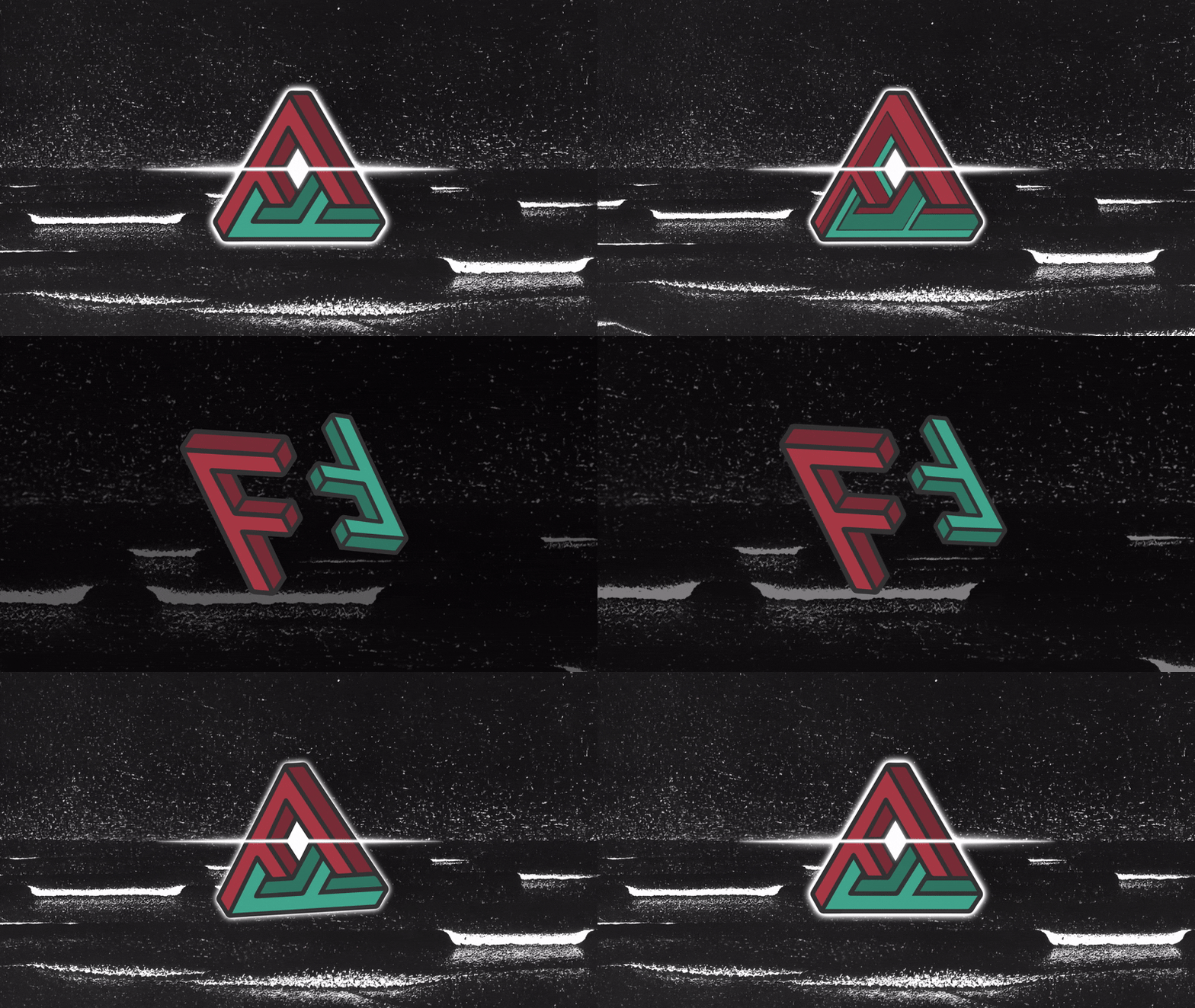
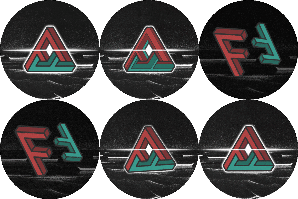
I must admit: The elusive symbol's outline was first sketched by a friend who just had the AFF abbreviation in mind.This provided us with a very strong structure.
We both chose the futuristic, complimentary colours.
I added the font, lightbeam & animation & together we founded A Future Force: a creative Discord community, full of young talent.
July, 2024
Rapper/ Producer
though firmly grounded;
this logo and its owner are basically twins.
We established this superhero-esque design had to have a mid-action-scene feel from the beginning.
This only took one sketch and one iteration because the artist & myself were on the same page from the beginning!
June, 2021
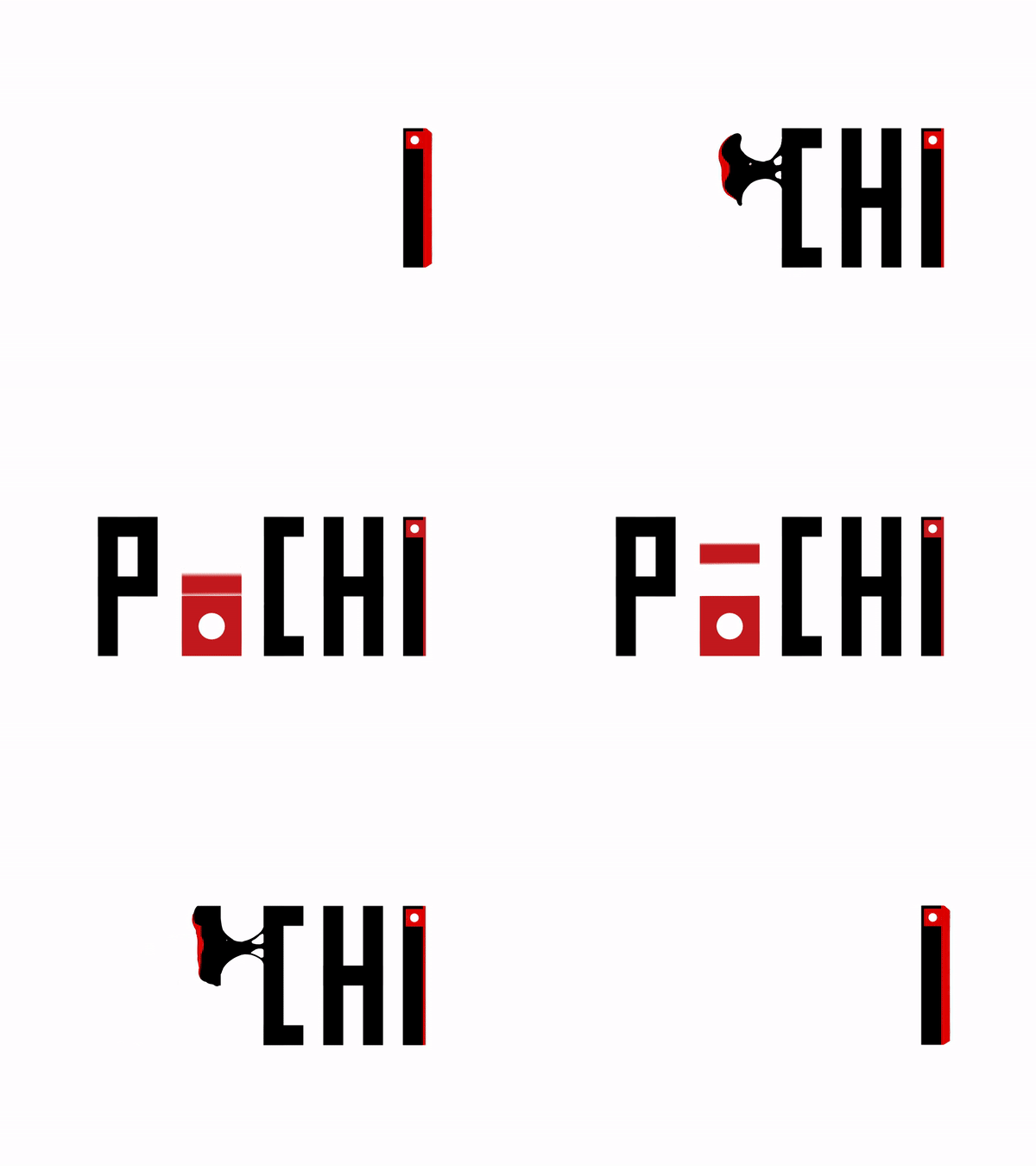
Made from Tyvek, the unrippable, flame retardant, water-resistant paper. This fun little Fold-It-Yourself box is lightweight, though heavy in its customizability.
Inspired, obviously, by Japanese minimalism, the logo & animation both start from right to left. The "I" being the pillbox itself.
April, 2024
The visual artist for whom this logo was made, tends to practice a lot of shadow work in his drawings (demons, darkness, chaos,...).
As his nickname is Martini, we decided to play with meanings:
- A snake that forms and L and an M at once.
- Laced means poisoned, that's why the olive's the final drop of it.
- Though Laced is derived from "shoelace," hence the snake's tail.
July, 2019
Rapper/ Producer
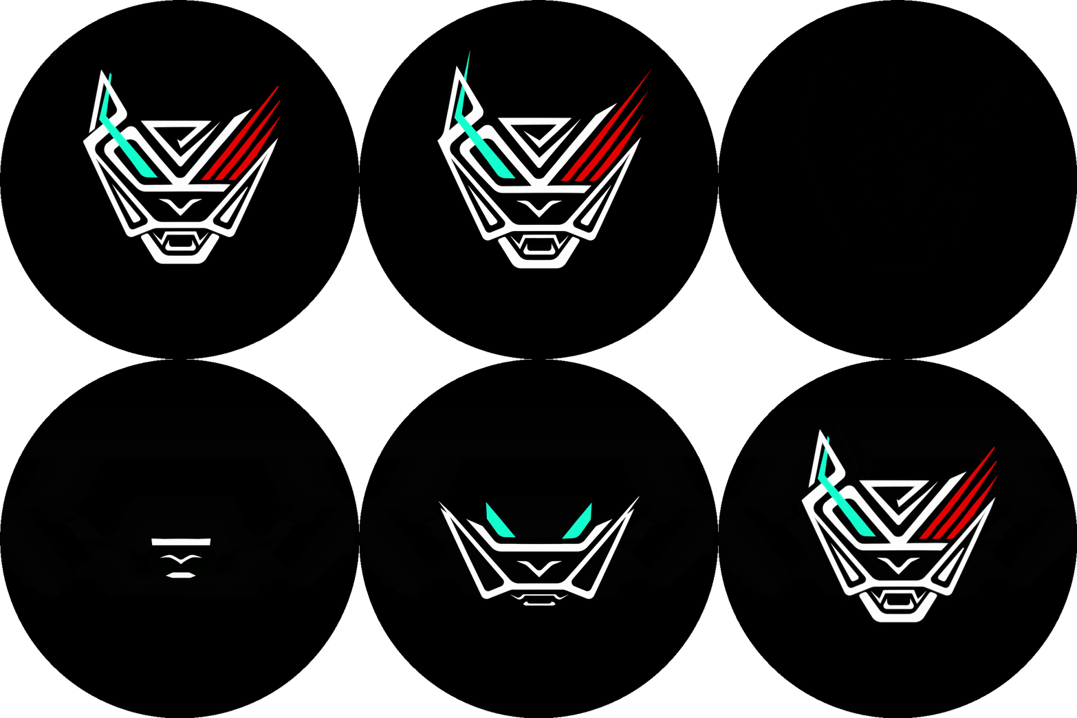
Flip the logo on its right side & it spells C.R.E., whilst being the Animal itself.
As his raps are a way of ventilating the horrors & abuse from his past, the looped animation plays out an origin story of how scars can define an individual.
In this case, a sharp-tongued & poetic lyricist.
Thusly, the teal stripe equals his inherent soft side &
the red scratch his,
musically more prevalent,
learned aggressive side.
.
Click here to visit his linktree & listen to his music.
February, 2024
Rage Rapper
Don't go spreading this around,... but I'm wildy arachnophobic. This made designing this into a challenge, especially the research stage.
Nonetheless, I managed to combine lil olibol's psychedelic character & dark musical thematics into this blend of a Rorschach test, an arachoid creature, wavey hairs,... combined with his very own facial features.
March, 2016
Yours Truly
RD is my first and personal logo. Starting this, I had the set goal in mind of creating a pattern from something assymetric that would lure you in its maze... and look satisfyingly perfect in infinite print on a kimono, as the (Japanese) belief of
Wabi Sabi dictates:
perfection comes through through imperfection.
This is a cornerstone of my work.
VIDEO
Below you will find a collection of the projects from my (academic) history in filmmaking. My earlier work focuses mostly on dramatic imagery and story, but if you observe my work in chronological order, you will find that it matures with age, knowledge and more importantly: teamwork. Because film takes a crew!
I also like to make stop motion -and typographic animations.
CONTACT ME
Thank you for your interest. For any inquiries, commission requests or studio visits, please contact me here.
+32 496 38 51 03


